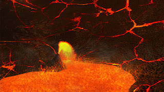
More concept for the game. We need to figure out what the platforms and ground might look like. The idea of the image on the right is that there is a vent pumping out water. There is an eel eating the stray fish that are shot out, preventing the player from using the force of the water to reach the platform. If the player tosses a rock or something into the vent, the eel will bite down and leave in pain, allowing progress.
Wednesday, September 19, 2012
Life.After Menu Interface Mockup
This is the final project for my Interface Design class. I decided to base it on a game idea of mine. It's a free-roaming survival-horror game about a survivor of the zombie apocalypse surviving the aftermath. The player must scavenge for food and supplies, evade and fight when necessary, and maintain a fortified safe house. The hook is the emphasis of using a bicycle to get around. The menus look nice in my opinion, but now I have to actually build it...
Main Menu
The three option screens. The idea is to use the LB and RB buttons to tab between screens. With the prototype, I ran into a few issues. I should indicate that those are the required buttons, and that I should enlarge the font of the currently selected options menu.
This is where you can either continue a game or select a new slot. Once again, I should show onscreen which buttons should be pressed (A to select and B to go back).
The ingame HUD. I added the X button up top to indicate a required input. The gun at the lower left is the currently selected weapon. The flashlight is the selected item. To give the player feedback of damage, the sides of the screen are filling with blood-splatter. The more blood, the more damage you have taken.
Abe Retouch
This was my midterm project for my digital imaging class. The assignment was to just clean up the black spots, but I figured I'd do more. I masked out Abe and added the flag background. The Gettysburg Address was the last addition, but I like how it turned out.
Monday, September 17, 2012
Some Random Doodles and Sketches
Figured I'd take a minute to post some of the things from my sketchbook I managed to come up with.
For this one, the idea was to concept out a button for an underwater sidescroller.
Always wanted to slay a beast, so why not this one?
I was supposed to come up with a "creepy mermaid" design. I like the changes to the tail and tenticle-like hair, but everyone says it reminds them of the ones from Harry Potter. Close, but not what I intened.
Random things from my Team Production project
Coming up with ideas for what we could have in the background. I imagine the player passing the ship in the background only to discover that it's figurehead is actually an enemy mermaid.
Tubes used for navigation. Think crazy-straws
I asked myself why I haven't zombified myself before lol.
Thursday, September 6, 2012
Thursday, August 9, 2012
Noir Table
A scene in Unity3D for my Texture and Lighting class. The blunderbuss in the back was provided, but I made the textures and other props. Tried to go for a specific mood.
Greek Shield Textures
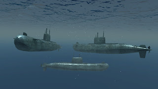
Submarine Textures
The model was provided by the instructor, but the textures and Unity3D scene is all me. Added light cookies to try to get the reflectivity and lighting right.
Wednesday, August 8, 2012
Subscribe to:
Comments (Atom)


